Scatter Plots
 [1]
[1]
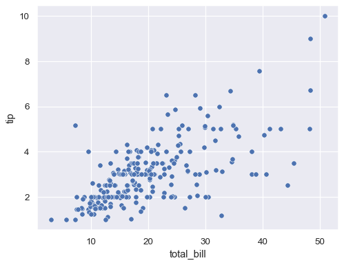
Also known as a scatter charts or a scatter graph, scatter plot is a visualization that utilizes dots to depict values for two different numeric variables. Each dot has an x (plotted horizontally) and a y value (plotted vertically) that together make up a single point of data. These charts are particularly useful in recognizing correlations between two variables in a set.
"A scatter plot's primary use is to observe and show relationships between two numeric variables. The dots in a scatter plot not only report the values of individual data points, but also patterns when the data are taken as a whole."[2]
 [3]
[3]
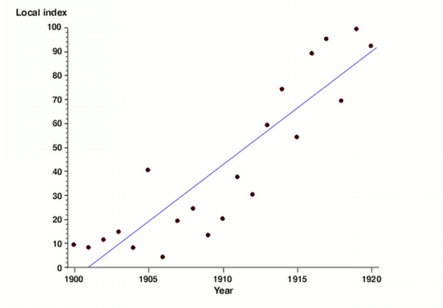
A common best practice with scatter plots is to make use of a trend line or line of best fit when looking at predictive or correlational relationship between variables. A trend line is particularly useful to the plot displaying how the the variables are similar, even in value; this gives a visual indication of how closely related the correlation between the two variables is. They also highlight outlier data a lot more easily as they generally fall further away from the range of the line of best fit.
Sources:[1] Image from: Seaborn.scatterplot
[2] Chartio - A Complete Guide to Scatter Plots
[3] Image from: Flexible smoothing with B-splines and Penalties or P-splines