Histograms
 [1]
[1]
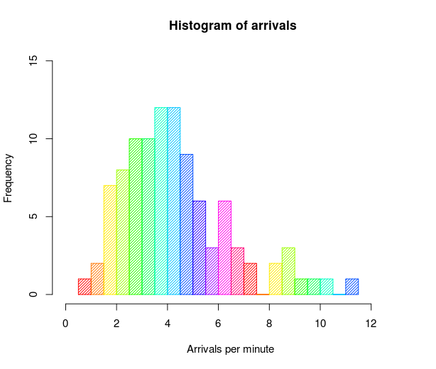
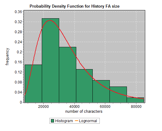
"A histogram is a chart that plots the distribution of a numeric variable’s values as a series of bars. Each bar typically covers a range of numeric values called a bin or class; a bar’s height indicates the frequency of data points with a value within the corresponding bin."[3]
 [2]
[2]
While they may look similar to bar charts, Histograms are used to show distributions of variables while bar charts are used to compare variables. Histograms plot quantitative data with ranges of the data grouped into bins or intervals while bar charts plot categorical data.
Histograms are used to summarize discrete or continuous data that are measured on an interval scale.
An advantage of histograms is for showing general distributional features of dataset variables. You can see roughly where the peaks of the distribution are, whether the distribution is skewed or symmetric, and if there are any outliers.[3]
An important aspect of histograms is that they must be plotted with a zero-valued baseline. Since the frequency of data in each bin is implied by the height of each bar, changing the baseline or introducing a gap in the scale will skew the perception of the distribution of data.
[1] Image Source: Wikipedia Commons
[2] Image Source: Wikipedia Commons
[3] Source: Chartio - A Complete Guide to Histograms