Charts
Bar Graphs
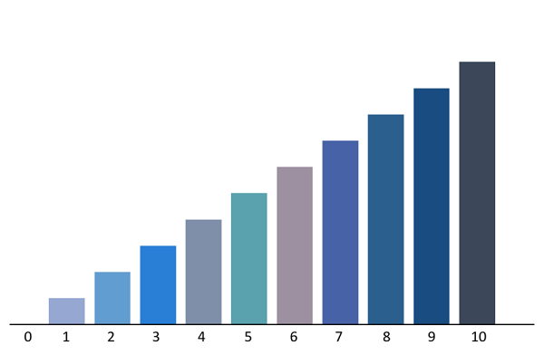 [1]A bar graph is a visualization used to represent data via bars of different heights, which can be plotted either
horizontally or vertically. Bar graphs are used to compare things between different groups or to track
changes over time. However, when trying to measure change over time, bar graphs are best when the
changes are larger.
[1]A bar graph is a visualization used to represent data via bars of different heights, which can be plotted either
horizontally or vertically. Bar graphs are used to compare things between different groups or to track
changes over time. However, when trying to measure change over time, bar graphs are best when the
changes are larger.
Bar graphs are used to provide a visual representation of categorical data, which is data that is grouped by alike characteristics, such as days of the week, months of the year, etc.
In addition to standard bar graphs, there are also two other types of bar graphs: grouped bar graphs and stacked bar graphs.
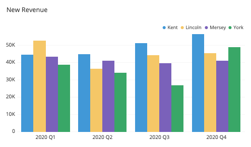 [2]Grouped bar graphs are bar graphs that compared multiple sets of data items. It is generally best to associate
each sub item in the group with a color to keep consistency and make the chart more easily readable.
[2]Grouped bar graphs are bar graphs that compared multiple sets of data items. It is generally best to associate
each sub item in the group with a color to keep consistency and make the chart more easily readable.
 [3]Stacked bar graphs are used to breakdown parts of a whole. Each bar in the chart represents a whole, and
segments in the bar represent different parts or categories of that whole. Different colors are used to
illustrate the different categories in the bar.
[3]Stacked bar graphs are used to breakdown parts of a whole. Each bar in the chart represents a whole, and
segments in the bar represent different parts or categories of that whole. Different colors are used to
illustrate the different categories in the bar.
[1] Image from: Wikipedia Commons
[2] Image from: Wikipedia Commons
[3] Image from: Wikipedia Commons
Source: Wikipedia - Bar chart
Line Graphs
|
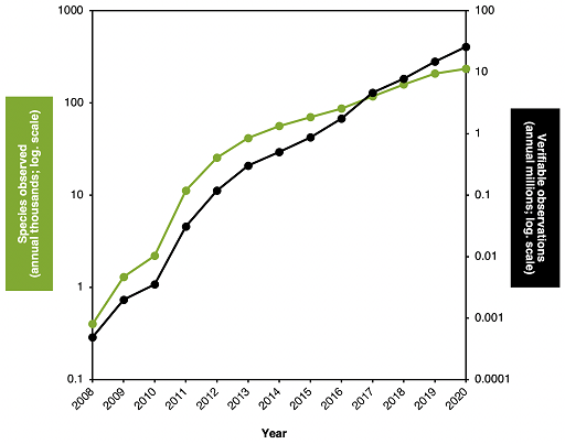
"A line graph is a type of visualization which displays information as a series of data points called 'markers' connected by straight line segments." [3] Unlike scatter plots, measurement points are ordered and connected together. |
 [2]
[2]
Line graphs are visualizations used to track changes over short and long periods of time. When smaller changes exist, line graphs are better to use than bar graphs. Line graphs can also be used to compare changes over the same period of time for more than one group.
Line graphs can track either one dataset or multiple sets related to an independent variable and are useful for comparisons.
Sources:
[1] Image Source: Wikipedia Commons
[2] Image Source: Wikipedia Commons
[2] Image Source: Wikipedia - Line chart
Pie Charts
|
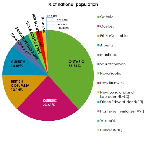
A pie chart is a circular graph that chunks the data into "pie slices", which are proportionally accurate percentage-wise to the quantity it represents. It is a way of summarizing a set of nominal data or displaying the different values of a given variable (e.g. percentage distribution). Pie charts are best used for displaying categorical data and to display how something is composed. On the other hand, they don't work very well for comparing groups to each other. When constructing a pie chart, best practice is order data items from largest to smallest, with the smallest item finishing off the chart. |
[1] Image from: Wikipedia Commons
[3] Source: Chartio - A Complete Guide to Pie Charts
Histograms
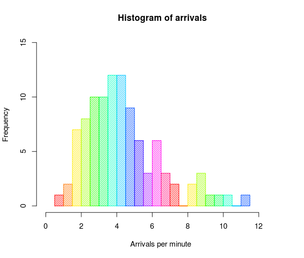 [1]
[1]
"A histogram is a chart that plots the distribution of a numeric variable’s values as a series of bars. Each bar typically covers a range of numeric values called a bin or class; a bar’s height indicates the frequency of data points with a value within the corresponding bin."[3]
 [2]
[2]
While they may look similar to bar charts, Histograms are used to show distributions of variables while bar charts are used to compare variables. Histograms plot quantitative data with ranges of the data grouped into bins or intervals while bar charts plot categorical data.
Histograms are used to summarize discrete or continuous data that are measured on an interval scale.
An advantage of histograms is for showing general distributional features of dataset variables. You can see roughly where the peaks of the distribution are, whether the distribution is skewed or symmetric, and if there are any outliers.[3]
An important aspect of histograms is that they must be plotted with a zero-valued baseline. Since the frequency of data in each bin is implied by the height of each bar, changing the baseline or introducing a gap in the scale will skew the perception of the distribution of data.
Sources:
[1] Image Source: Wikipedia Commons
[2] Image Source: Wikipedia Commons
[3] Source: Chartio - A Complete Guide to Histograms
Scatter Plots
 [1]
[1]
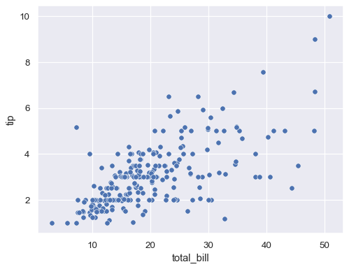
Also known as a scatter charts or a scatter graph, scatter plot is a visualization that utilizes dots to depict values for two different numeric variables. Each dot has an x (plotted horizontally) and a y value (plotted vertically) that together make up a single point of data. These charts are particularly useful in recognizing correlations between two variables in a set.
"A scatter plot's primary use is to observe and show relationships between two numeric variables. The dots in a scatter plot not only report the values of individual data points, but also patterns when the data are taken as a whole."[2]
 [3]
[3]
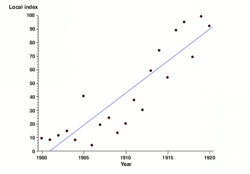
A common best practice with scatter plots is to make use of a trend line or line of best fit when looking at predictive or correlational relationship between variables. A trend line is particularly useful to the plot displaying how the the variables are similar, even in value; this gives a visual indication of how closely related the correlation between the two variables is. They also highlight outlier data a lot more easily as they generally fall further away from the range of the line of best fit.
Sources:[1] Image from: Seaborn.scatterplot
[2] Chartio - A Complete Guide to Scatter Plots
[3] Image from: Flexible smoothing with B-splines and Penalties or P-splines
Box Plots
 [1]
[1]
"A box plot or boxplot (also known as box and whisker plot) is a type of chart often used in explanatory data analysis. Box plots visually show the distribution of numerical data and skewness through displaying the data quartiles (or percentiles) and averages." [2]
A box plot is ideal for comparing distributions because the centre, spread and overall range are immediately apparent. They also have the advantage of taking up less space, which is useful when comparing distributions between many groups or datasets.
Box plots are used to help visualize the distribution of quantitative values in a field. They are also valuable for comparisons across different categorical variables or identifying outliers, if either of those exist in a dataset. Its ideal use is for comparing distributions because the centre, spread and overall range are immediately apparent.[2]
Sources:[1] Image from: Wikipedia Commons
[2] Simply Psychology - Box Plot